What is a block pattern?
A block pattern is a predefined group of blocks that have been combined to create a reusable layout element. Once inserted into a post or page, the pattern will behave the same as regular, separate blocks, each with their own unique content and attributes. This makes block patterns ideal for creating a suite of ‘building blocks’ that can be used to quickly and easily build complex, well-designed layouts with a minimal amount of effort.
Within the block editor, users can browse through a variety of pre-made patterns as well as any custom patterns that have been registered by their theme/plugins and see a visual preview of each block pattern before adding it to a post or page with a single click. WordPress even maintains a block pattern directory which showcases many use cases for block patterns, with hundreds of user-created patterns on display that can be copy/pasted directly into the content of any WordPress site regardless of the theme in use.
During the recent rebuild of our own website which utilises a block theme and full-site editing, we discovered that creating custom block patterns allowed us to build our own library of theme-specific ‘building blocks’ which can be used by anyone to create feature-rich pages in seconds whilst remaining consistent with our overall design.
How do you create a block pattern?
Block patterns are built using block markup, which is the content that WordPress stores within a post and typically looks something like this:
<!-- wp:columns -->
  <div class="wp-block-columns"><!-- wp:column {"width":"50%"} -->
  <div class="wp-block-column" style="flex-basis:50%"><!-- wp:image -->
  <figure class="wp-block-image"><img alt=""/></figure>
  <!-- /wp:image --></div>
  <!-- /wp:column -->

  <!-- wp:column {"width":"50%"} -->
  <div class="wp-block-column" style="flex-basis:50%"><!-- wp:image -->
  <figure class="wp-block-image"><img alt=""/></figure>
  <!-- /wp:image --></div>
  <!-- /wp:column --></div>
<!-- /wp:columns -->
The above code defines a columns block which contains two equal columns each with an image block inside. This style of markup is fairly unwieldy to work with as it contains a mixture of WordPress block comments and attributes alongside HTML which must contain the exact content and attributes expected by each block in order for it to remain valid.
The good news is that you will rarely write this markup manually. Instead you can simply copy/paste your blocks directly from the block editor into patterns and vice-versa. As well as being extremely portable, this approach forces you to place and manipulate blocks just as a user would, before going ahead and extracting the end result into a block pattern.
Registering a block pattern
Block patterns cannot currently be defined by users and must be registered in code using the register_block_pattern PHP function provided by WordPress. This function requires two arguments:
- Pattern name (including namespace) –
string - Pattern properties –
array
The pattern properties array requires at least a title which is the human-readable name for your pattern and content which will be a string containing your fully-formed block markup.
<?php
/**
 * Register a block pattern to display two images side by side.
 */
function bigbite_register_my_pattern() {
  register_block_pattern(
    'bigbite/two-images-side-by-side',
    [
      'title'      => esc_html__( 'Two images side-by-side', 'bigbite' ),
      'categories' => [ 'bigbite-content' ],
      'content'    => '<!-- wp:columns -->
      <div class="wp-block-columns"><!-- wp:column {"width":"50%"} -->
      <div class="wp-block-column" style="flex-basis:50%"><!-- wp:image -->
      <figure class="wp-block-image"><img alt=""/></figure>
      <!-- /wp:image --></div>
      <!-- /wp:column -->
      <!-- wp:column {"width":"50%"} -->
      <div class="wp-block-column" style="flex-basis:50%"><!-- wp:image -->
      <figure class="wp-block-image"><img alt=""/></figure>
      <!-- /wp:image --></div>
      <!-- /wp:column --></div>
      <!-- /wp:columns -->',
    ]
  );
}
add_action( 'init', 'bigbite_register_my_pattern' );
Differences between patterns, templates and template parts
Block themes introduce the concept of block templates and template parts, which also utilise the same type of block markup used to register a block pattern. The main difference is that both templates and template parts are stored in .html files which can only contain valid block markup.
Whilst templates are used to build entire page layouts, both template parts and patterns offer ways for you to abstract sections of a page into a reusable format that can be inserted into more than one template. The main way that template parts and patterns differ is that the content within a template part will be ‘synced’ everywhere it appears, similar to how reusable blocks work. Changes to block patterns on the other hand will only be ever be stored in the specific place they have been updated.
Because of their decoupled nature, any updates you make to your pattern during registration will not be applied to places where you have used this pattern previously. For this reason it makes the most sense to create patterns towards the end of a project, where the blocks, styles and attributes that make up your page sections have been clearly defined, so that you can simply extracting the layout elements you want to turn into patterns and make them available to users when they come to build out new posts and pages.
Use cases for block patterns
When working in full-site editing and using block themes, one of the major adjustments you need to make is that your template files can only contain valid block markup which consists of HTML and block comments. This limitation makes patterns even more valuable, as since patterns are defined in PHP functions you are able to use PHP in their markup to swap in dynamic content that would otherwise not be possible, then reference the pattern inside your template file instead of the individual blocks. For example, we used this on our recent site rebuild to generate dynamic image links which sync across development and production environments:
'title'    => __( 'Office Logo Image', 'bbv3' ),
	'inserter' => false,
	'content'  => '<!-- wp:image {"id":4368,"sizeSlug":"large","linkDestination":"none"} -->
  <figure class="wp-block-image size-large"><img src="' . esc_url( home_url() ) . '/wp-content/uploads/2022/05/BigBite-4.jpg" alt="" class="wp-image-4368"/></figure>
  <!-- /wp:image -->',
If the above blocks were inserted directly into a page template, we’d be unable to utilise home_url() and the image src would point directly to a file on a specific domain. By using setting inserter => false during pattern registration we can also choose to prevent this pattern from showing up to users when they’re browsing the pattern library inside the block editor.
This technique is also used heavily by the flagship twentytwentytwo WordPress theme for internationalisation purposes, amongst other things:
'title'    => __( 'Heading and bird image', 'twentytwentytwo' ),
	'inserter' => false,
	'content'  => '<!-- wp:group {"align":"full","style":{"spacing":{"padding":{"top":"0px","bottom":"0px"}}},"layout":{"inherit":true}} -->
					<div class="wp-block-group alignfull" style="padding-top:0px;padding-bottom:0px;"><!-- wp:heading {"align":"wide","style":{"typography":{"fontSize":"var(--wp--custom--typography--font-size--colossal, clamp(3.25rem, 8vw, 6.25rem))","lineHeight":"1.15"}}} -->
					<h2 class="alignwide" style="font-size:var(--wp--custom--typography--font-size--colossal, clamp(3.25rem, 8vw, 6.25rem));line-height:1.15">' . wp_kses_post( __( '<em>The Hatchery</em>: a blog about my adventures in bird watching', 'twentytwentytwo' ) ) . '</h2>
					<!-- /wp:heading --></div>
					<!-- /wp:group -->

					<!-- wp:image {"align":"full","sizeSlug":"full","linkDestination":"none"} -->
					<figure class="wp-block-image alignfull size-full"><img src="' . esc_url( get_template_directory_uri() ) . '/assets/images/flight-path-on-transparent-c.png" alt="' . esc_attr__( 'Illustration of a bird flying.', 'twentytwentytwo' ) . '"/></figure>
					<!-- /wp:image -->',
Block pattern examples
Heading with text
A common pattern we use throughout our site pages and case studies utilises a two-column layout where the heading appears on the left and the remaining text on the right:

Although seemingly straightforward, to add this layout to a page requires several steps:
- Insert a columns block
- Select a 30/70 columns layout
- Select the ‘large gap’ custom block style on the columns block
- Insert a heading block into the first column
- Insert a paragraph block into the second column
Despite each individual step being small, the combined overhead of going through this process makes it more difficult for users to utilise this layout within pages, and increases the possibility of making an error resulting in slightly different layouts across pages. By extracting this group of blocks into a pattern we remove all of the friction involved and make it trivial to use the layout over and over again.
Page hero
We also use a similar header/hero area at the top of several pages, in both dark and light variations. This layout is surprisingly complex to get right in terms of alignment, padding and responsiveness, so again by extracting this into pre-made block patterns we can shield users from having to tweak settings to achieve a perfect layout and instead they can simply choose which version they want to include in the page with a few clicks.

What’s next for block patterns?
The workflow around copying groups of blocks between pages and templates is undeniably powerful and is definitely going to be sticking around as WordPress and the Gutenberg project push their block editor towards the future. However, there is still room for improvement in terms of how block patterns are made discoverable by end users.
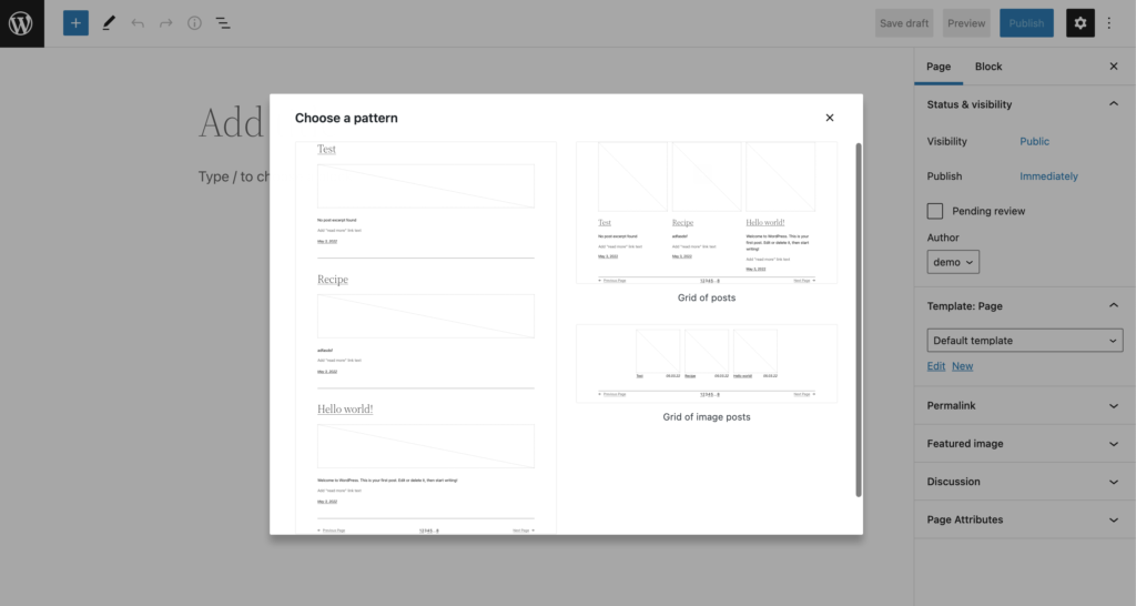
In the recent WordPress 6.0 update, additional support has been added to display patterns in a modal window when creating a new page or post, which is an exciting step forward in promoting the adoption of block patterns. This feature also opens up the possibility for developers to create full-page templates as block patterns, allowing users to choose from multiple page structures using a visual interface instead of starting with a blank canvas when creating a new page or post.
