Introduced in the recently released WordPress 6.5, the Interactivity API provides a standard way for developers to add interactions to the front end of blocks. Here we’re going to put together a simple example using the create-block package, as it has a convenient template for setting up interactive blocks. If you have your own build systems in place – like we do here at Big Bite – then you’ll need to make sure your blocks have the following in their block.json:
"supports": {
   "interactivity": true
},
Before you get started, please also note that this demo will only work in WordPress 6.5 (or later versions), and you’ll need Node.js and npm, as well as a local development environment (we recommend WP ENV or Local.
Demo code
All of the code from this tutorial is available here: Interactivity API Demo
Prerequisites
WARNING
This demo requires WordPress 6.5 or later and will not work in previous version
What are we building?
In this demo we’re going to make a basic reading mode block that simply sets a dark mode state. We’re also going to build a ‘notification’ block that changes its own appearance depending on the reading mode state, and handles whether it’s expanded or not.

Step 1 – Setup the reading mode block
Create a skeleton block using create block with the interactivity template
cd {insert-local-path}/www/wp-content/plugins
npx @wordpress/create-block --template @wordpress/create-block-interactive-template
You will be prompted to customise the plugin:
- Use
reading-modeas the block slug - When prompted and here we use something unique for the
internal namespace

Watch the plugin for changes
cd reading-mode
npm run start
IMPORTANT
Only edit the files inside the src directory, files in the build directory will be overwritten.
Step 2 – Add an interactivity store
The block should now be scaffolded, able to recognise your code changes, and automatically rebuild the block assets into the build directory. You should also now be able to see a view.js file in the src directory – this is the file that will be loaded on the front end when the block is used. The block.json file should already include this, which means you don’t need to do anything to make sure it’s loaded.
The Interactivity API uses ‘stores’ to provide actions, which are essentially just functions that will run when a user interaction occurs. The store can also be used to set state– the naming here is confusing if you’ve used state in other instances (such as react and various other libraries), however in this context, state sets values that all blocks on a page may need access to. It might be more helpful to think of state as the global state.
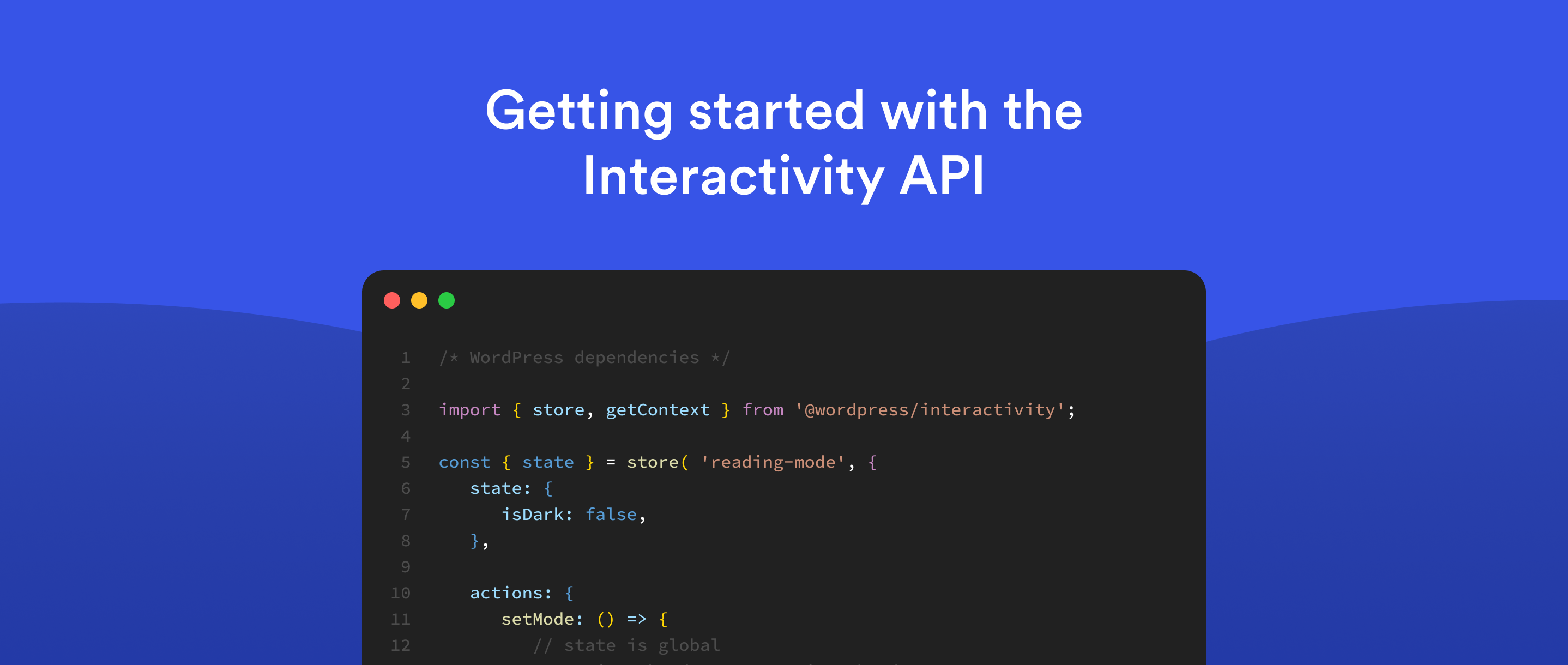
As we’re going to set a reading mode that many other blocks might need to react to, we can use state in this instance. Replace the existing view.js file with the following to setup the interactivity store, and add some default state:
/**

* WordPress dependencies

*/

import { store, getContext } from '@wordpress/interactivity';

const { state } = store( 'reading-mode', {
   state: {
      isDark: false,
   },

   actions: {
      setMode: () => {
         // state is global
         state.isDarkMode = !state.isDarkMode;
      },
   },
} );
All we’re doing in the above code is setting state for isDark and making it false by default. We’re also setting an action to toggle the isDark state when the user interacts with the toggle.
Step 3 – Add the render for the toggle button
Open the render.php inside the block src folder and replace the markup with the following code, this renders an input and a label for the mode toggle (we will style this later)
<?php

$unique_id          = wp_unique_id('p-');

$wrapper_attributes = get_block_wrapper_attributes();

?>

<div

<?php echo $wrapper_attributes; ?>

>

<div class="mode-button">

<input class="mode-button-input" type="checkbox" id="switch<?php echo $unique_id_append; ?>" name="mode">

<label for="switch<?php echo $unique_id_append; ?>">Toggle</label>

</div>

</div>
At the moment the render has no connection to the interactivity API, we can enable this by using data attributes. Add the data attrbiutes below – these are called directives in the API docs:
<?php

$unique_id          = wp_unique_id('tog-');

$wrapper_attributes = get_block_wrapper_attributes();

?>

<div

<?php echo $wrapper_attributes; ?>

data-wp-interactive="reading-mode"

data-wp-class--isDark="state.isDarkMode"

>

<div class="mode-button">

<input class="mode-button-input" type="checkbox" id="switch<?php echo $unique_id_append; ?>" name="mode">

<label data-wp-on--click="actions.setMode" for="switch<?php echo $unique_id_append; ?>">Toggle</label>

</div>

</div>
data-wp-interactive is a directive that enables the interactivity API for the element and it’s children and the data-wp-class directive will add or remove a class on a HTML element. The data-wp-on--click directive provides the key to this simple functionality, it instruct the interactivy API to run the setMode function in our action everytime the element is clicked. If we look back at our setMode function you will notice it toggles the global isDark value:
setMode: () => {
   // state is global
   console.log('is dark');
   state.isDark = !state.isDark;
}
Step 4 – Add CSS for the toggle button
We won’t go through the code here – just add this to the style.scss file for the block, and you should have a styled toggle:
.wp-block-bigbite-reading-mode input[type=checkbox] {
	height: 0;
	width: 0;
	visibility: hidden;
  }

  .wp-block-bigbite-reading-mode label {
	cursor: pointer;
	text-indent: -9999px;
	width: 55px;
	height: 30px;
	background: #FFBD07;
	margin: 0 auto;
	display: flex;
	justify-content: center;
	align-items: center;
	-webkit-border-radius: 100px;
	-moz-border-radius: 100px;
	border-radius: 100px;
	position: relative;
  }

  .wp-block-bigbite-reading-mode label:after {
	content: '';
	background: #fff;
	width: 20px;
	height: 20px;
	-webkit-border-radius: 50%;
	-moz-border-radius: 50%;
	border-radius: 50%;
	position: absolute;
	top: 5px;
	left: 4px;
        transition: cubic-bezier(0.68, -0.55, 0.27, 01.55) 320ms;
  }

  .wp-block-bigbite-reading-mode input:checked + label {
	background: black;
  }

  .wp-block-bigbite-reading-mode input:checked + label:after {
	left: calc(100% - 5px);
	-webkit-transform: translateX(-100%);
	-moz-transform: translateX(-100%);
	-ms-transform: translateX(-100%);
	-o-transform: translateX(-100%);
	transform: translateX(-100%);
  }
Step 4 – Test the block
In the WordPress dashboard:
- Activate the block plugin in the dashboard
- Add a post / page
- Add a reading mode block
- Save the page
- View the post / page and click the toggle
Now when you view the created post/page and click the toggle, you should see the toggle animate. In this simple example, you’ve built some basic functionality that toggles the class on an element based on the value of some global state.
Preview of what we’re building: Demo
Step 6 – Create Notification block
We’re now going to add another block to our project that will also use the global state. For the sake of this tutorial, we’re going to create a basic ‘notification’ block that will change its styles depending on the global state. It will also toggle its own state when clicked.
Firstly add the block:
npx @wordpress/create-block --template @wordpress/create-block-interactive-template
You will be prompted to customise the plugin;
- Use
notificationas the block slug - Use something unique for the
internal namespace
Next, activate the plugin in the dashboard.
Add a store for your block, and in the view.js file for the block, replace the existing code with the following:
import { store, getContext } from '@wordpress/interactivity';

store( 'notification', {
	actions: {
		toggle: () => {
			const context = getContext();
			//const state = getState();
			context.isOpen = ! context.isOpen;
		},
	},
	callbacks: {
		logIsOpen: () => {
			const { isOpen } = getContext();
			// Log the value of `isOpen` each time it changes.
			console.log( `Is notification open: ${ isOpen }` );
		},
	},
} );
This will toggle the isOpen status and also runs a callback so you can see in the console when any value changes
Now inside the render.php for the new block, add the render for the block:
<?php
$unique_id          = wp_unique_id('p-');
$wrapper_attributes = get_block_wrapper_attributes();
?>

<div
    data-wp-interactive="reading-mode"
    data-wp-class--isDark="state.isDarkMode"
    >
    <div
        <?php echo get_block_wrapper_attributes(); ?>
        data-wp-interactive="notification"
        data-wp-context='{ "isOpen": false }'
        data-wp-watch="callbacks.logIsOpen"
    >
        <div class="teaser">
            <div>
                <p><?php echo esc_html(__('Notification Block', 'bigbite')); ?></p>
            </div>
            <button
                data-wp-on--click="actions.toggle"
                data-wp-bind--aria-expanded="context.isOpen"
                data-wp-class--isOpen="context.isOpen"
                aria-controls="<?php echo esc_attr($unique_id); ?>"
            >
            <svg width="20px" height="20px" viewBox="0 0 24 24" fill="none" xmlns="http://www.w3.org/2000/svg">
                <path d="M7 10L12 15L17 10" stroke="#000000" stroke-width="1.5" stroke-linecap="round" stroke-linejoin="round"/>
            </svg>
            </button>
        </div>

        <div
                id="<?php echo esc_attr($unique_id); ?>"
                data-wp-bind--hidden="!context.isOpen"
                class="content"
            >
                <?php
                    echo wp_kses_post(html_entity_decode($content));
                ?>
            </div>
    </div>
</div>
The data-wp-class--isDark="state.isDark" will make sure the block has a class that binds to the global isDark state, so whenever the user clicks the dark mode toggle the class will be updated.
The block also handles it’s own interactvity, so when the arrow button is clicked the toggle action is run:
<button

data-wp-on--click="actions.toggle"
The notifcation content uses a bind directive to toggle it’s visibility depending on whether the notification is openor not:
<div
	id="<?php echo esc_attr( $unique_id ); ?>"
	data-wp-bind--hidden="!context.isOpen"
	class="content"
>
	<?php
		echo wp_kses_post( html_entity_decode( $content ) );
	?>
</div>
Add some styles for the block in the styles.scss for the block:
.wp-block-bigbite-notification button {
	border: 0;
	outline-width: 0;
	background: 0;
}

.wp-block-bigbite-notification {
	width: 100%;
	margin-bottom: 20px;
	padding: 0 20px;
	background-color: white;
	border-radius: 5px;
	box-shadow: 0px 15px 19px 0px rgb( 0, 0, 0, .2 );
}

.wp-block-bigbite-notification .content {
	padding-bottom: 20px;
}

.wp-block-bigbite-notification .teaser {
	display: flex;
	align-items: center;
	justify-content: space-between;
}

.wp-block-bigbite-notification button.isopen {
	transform: rotate(180deg);
}

.isdark .wp-block-bigbite-notification {
	background-color: black;
	color: white;
}

.isdark .wp-block-bigbite-notification button {
	background: none;
}

.isdark .wp-block-bigbite-notification p {
	background: black;
	color: white;
}

.isdark .wp-block-bigbite-notification button svg path {
	stroke: white;
}
To allow you to add inner blocks to the notification, replace the contents of the src/edit.js for your block – this will allow you to add some custom text for your notification content:
import { useBlockProps, InnerBlocks } from '@wordpress/block-editor';

export default function Edit( { attributes, setAttributes } ) {
	const blockProps = useBlockProps();

	return (
		<div { ...blockProps }>
			<InnerBlocks />
		</div>
	);
}
Finally, add a save.js file and include it in the index.js so that the inner block content is saved:
save.js:
import { InnerBlocks } from '@wordpress/block-editor';

export default function save() {
	return <InnerBlocks.Content />;
}index.js:
import Save from './save';

 */
registerBlockType( metadata.name, {
	/**
	 * @see ./edit.js
	 */
	edit: Edit,
	save: Save
} );
Step 7 – Test the blocks
- Return to the previous page in the dashboard that you were editing
- Add some notifications blocks to the page, add some content and save the page
- View the front end of the website
When you view the front end of the website, you should now have notification blocks that you can expand and close, and the reading mode toggle should toggle the styles on the notifIcation.
Finished!
Obviously this simple example could be easily replicated with some custom JavaScript, however using the Interactivity API offers a number of advantages. In addition to the all-important benefits at scale, the extensive directives provided with the API can significantly reduce the amount of custom JavaScript you need to write on the front end to respond to common user interactions. Dom manipulation can also often be difficult to maintain, which means embracing the Interactivity API could resolve many pain points for you across the longer term, making it a worthwhile option for your upcoming projects.


