.cp_embed_wrapper{margin-bottom:28px}
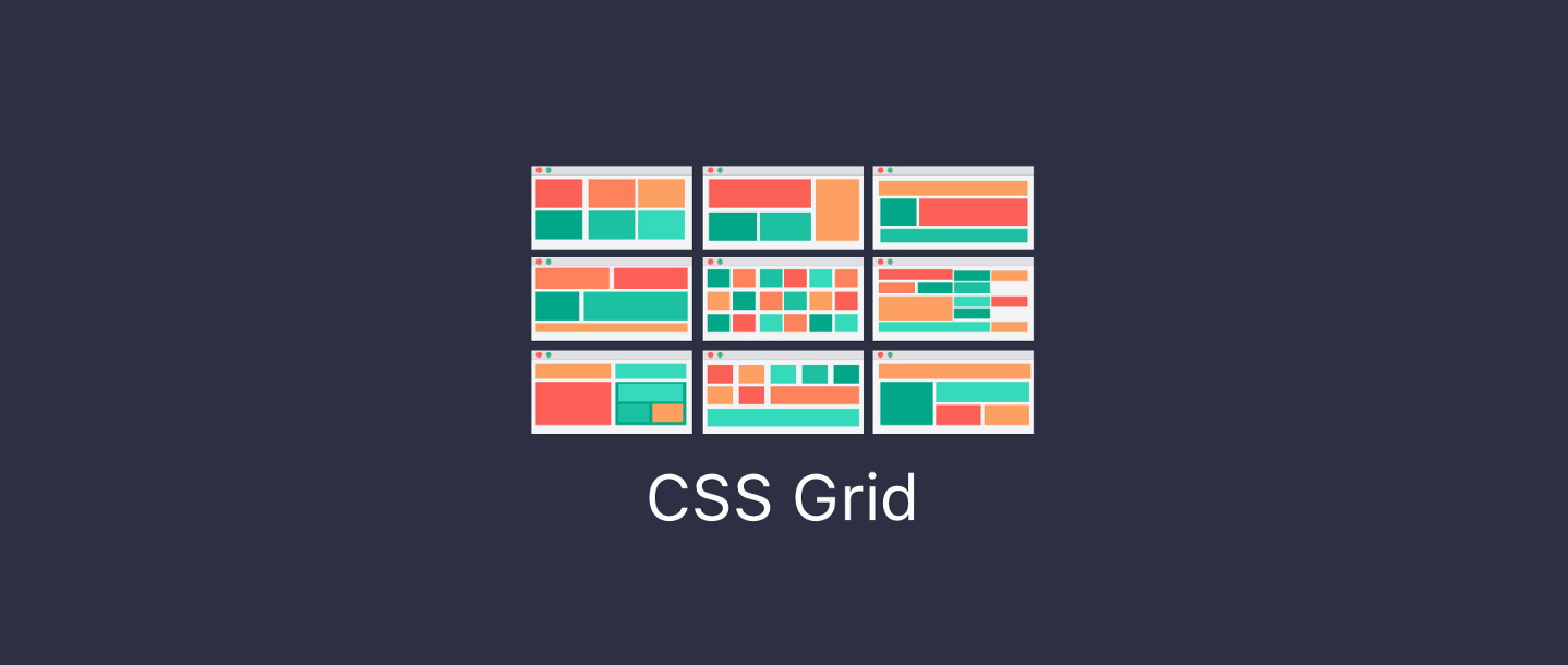
But what is it? CSS grid is a new method to create 2d layouts, similar to tables. However, unlike tables, the structures of these layouts can be altered using media queries.
Grid vs Flexbox
Although it would seem that grid is a replacement for flexbox, this is not the case. Grid is very good for 2d layouts and it’s great at keeping your content where it should be, whereas flexbox is for 1-dimensional content, it’s either rows or columns; not both. Flexbox and grid are designed to work together to create complex layouts.
The basics
Creating the grid
Creating a basic grid layout is simple, first, we will set up our markup:
<div class="grid-wrapper">
    <div class="grid-item">1</div>
    <div class="grid-item">2</div>
    <div class="grid-item">3</div>
    <div class="grid-item">4</div>
    <div class="grid-item">5</div>
</div>
.grid-wrapper {
display: grid;
}From this, we have added the grid layout. It won’t look any different yet since there is only one column. If we want to make this example resemble a grid, then we need to add grid tracks.
See the Pen QaxErp by Big Bite (@bigbite) on CodePen.
Adding grid tracks
Rows and columns are defined by grid-template-rows and grid-template-columns, respectively. By defining these two properties, you are defining the grid tracks.
Let’s expand upon our previous example by adding the grid-template-columns property, and make each column separated by a space. E.g:
.grid-wrapper {
    display: grid;
    grid-template-columns: 100px 100px 100px;
}
See the Pen RxJRJb by Big Bite (@bigbite) on CodePen.
The above example would create 3 columns each 100px in length. A column can be any unit, including the all-new fr unit which helps define flexible grid tracks. This new unit, fr, represents a fraction of the remaining space available in the grid container. Let’s change our previous example to use the fr unit so our grid tracks become flexible:
.grid-wrapper {
    display: grid;
    grid-template-columns: 1fr 1fr 1fr;
}
See the Pen xpzOzy by Big Bite (@bigbite) on CodePen.
If we set one of the column values to 2fr this causes the remaining space to be split into 4, where 2 parts are given to the 2fr and 1 part for 1fr. E.g:
.grid-wrapper {
    display: grid;
    grid-template-columns: 2fr 1fr 1fr;
}
See the Pen WdyxKR by Big Bite (@bigbite) on CodePen.
You can mix the values when defining these tracks, for example, you can have:
.grid-wrapper {
    display: grid;
    grid-template-columns: 100px 3fr 1fr;
}
See the Pen eyKzjM by Big Bite (@bigbite) on CodePen.
The above example would create 3 columns; the first being a solid pixel value, this won’t change. This leaves us with a lot of remaining space that will be split into 4, with the 2nd column filling 3/4 of the space, and the remaining column filling 1/4.
Using repeat()
Repeat becomes useful when you are creating numerous consecutive columns that are the same size. For example:
.grid-wrapper {
    display: grid;
    grid-template-columns: 1fr 1fr 1fr;
}
Now can be written like this:
.grid-wrapper {
    display: grid;
    grid-template-columns: repeat(3, 1fr);
}
See the Pen JMZKBw by Big Bite (@bigbite) on CodePen.
You could even make a 12 column grid like so:
.grid-wrapper {
    display: grid;
    grid-template-columns: repeat(12, 1fr);
}
As with all of the column definitions you can mix and match values so, for example, if you have this definition:
.grid-wrapper {
    display: grid;
    grid-template-columns: 100px 100px 100px 1fr 50px 50px 3fr 1fr;
}
With repeat, you can simplify this down to:
.grid-wrapper {
    display: grid;
    grid-template-columns: repeat(3, 100px) 1fr repeat(2, 50px) 3fr 1fr;
}
If you had a sequence of columns that repeated, for example:
.grid-wrapper {
    display: grid;
    grid-template-columns: 1fr 2fr 3fr 1fr 2fr 3fr 1fr 2fr 3fr;
}
You can use the repeat function to declare your sequence like so:
.grid-wrapper {
    display: grid;
    grid-template-columns: repeat(3, 1fr 2fr 3fr);
}
Note: See how the sequence is not comma separated, it is passed as a singular argument. repeat(timesToRepeat, sequenceToRepeat)
Implicit and explicit grid
CSS grid can work by either being implicitly or explicitly declared. Example: in all of the previous examples we explicitly set our grid columns using grid-template-columns, but we let the browser choose how the rows work as these are implicit. You can use grid-auto-columns and grid-auto-rows as a way to implicitly declare columns/rows. An example of how that would work:
.grid-wrapper {
    display: grid;
    grid-template-columns: repeat(3, 200px);
    grid-auto-rows: 100px;
}
The previous example explicitly declares 3 columns but it implicitly says ‘all of my rows should be 200px in height’ but lets the browser decide on how many rows it should create.
See the Pen NXzrLd by Big Bite (@bigbite) on CodePen.
minmax()
When creating your grid columns/rows you might want them to be at least a certain height/width, but will go to another defined size. This is where minmax comes in. For example, let’s make our auto rows have a minimum size of 200px and allow them to grow to content size. Taking our previous example:
.grid-wrapper {
    display: grid;
    grid-template-columns: repeat(3, 200px);
    grid-auto-rows: minmax(100px, auto);
}
By using auto as our ‘max’ value this allows the browser to automatically choose the height of that row based on content size.
See the Pen goKMBa by Big Bite (@bigbite) on CodePen.
Position items in the grid
Positioning items on the grid is straight forward, although it doesn’t work how you’d expect. When we define our grid we define the tracks, but when positioning items we position them on the grid lines.
This is what the grid lines look like on a 3 column, 2-row grid. It’s worth noting that the column lines are based on the text direction, for example, if you are using RTL then the line numbers are backwards and start from the right.

Positioning items on the grid are controlled by 4 properties: grid-column-start,grid-column-end,grid-row-start, and grid-row-end. There are short-hand variants of these which we will go in to further down the article.
If we take our first example, but add classes to identify each one:
Markup:
<div class="grid-wrapper">
    <div class="grid-item item-1">1</div>
    <div class="grid-item item-2">2</div>
    <div class="grid-item item-3">3</div>
    <div class="grid-item item-4">4</div>
    <div class="grid-item item-5">5</div>
</div>
Grid Styles:
.grid-wrapper {
    display: grid;
    grid-template-columns: repeat(3, 200px);
    grid-auto-rows: minmax(100px, auto);
}
Let’s make the first item span the entire top row. Notice how the column end is 4, but we only have 3 columns. Remember when we said that we position it on the lines rather than the cells:
.item-1 {
  grid-column-start: 1;
  grid-column-end: 4;
}
See the Pen jYKrew by Big Bite (@bigbite) on CodePen.
Now, let’s make expand upon the previous example to make the item span 2 rows, following the same syntax as before:
.item-1 {
  grid-column-start: 1;
  grid-column-end: 4;
  grid-row-start: 1;
  grid-row-end: 3;
}
See the Pen GyGqwJ by Big Bite (@bigbite) on CodePen.
Our previous example can be simplified by using the shorthand variants of these properties, grid-column and grid-row. So let’s makes item-2 span two columns and two rows using the shorthand variants. The beginning and end points of the track are separated by a / for example grid-column: <column-start> / <column-end>
.item-2 {
    grid-column: 1 / 3;
    grid-row: 3 / 5;
}
See the Pen ppKbQW by Big Bite (@bigbite) on CodePen.
The previous example would position item 2 on line 3 until line 5 (underneath item-1). Writing/working out an item’s start and end point can get quite frustrating, what if you could just tell an item to start here and fill x number of cells? Well, you can, using span! Let’s make item-3 span two rows, but we will utilise span this time instead of declaring the start and end:
.item-3 {
    grid-column-start: 3;
    grid-row: 3 / span 2;
}
See the Pen JMZKex by Big Bite (@bigbite) on CodePen.
Since grid will automatically place items that haven’t been set explicitly. We can also just tell the browser to span x number of rows and columns, for example, we can set item-5 to span 2 columns by only setting the grid-column-end property and ignoring the start, the same can be done with rows:
.item-5 {
    grid-column-end: span 2;
}
See the Pen RxJREN by Big Bite (@bigbite) on CodePen.
Grid area
Looking back at the first and second item examples, you can see they’re quite long. But have no fear, there is an even shorter version we can use, grid-area. Using grid-area can help shorten the lines of code and saves a lot of typing. The syntax is a little strange, but similar to the grid-row or grid-column. Syntax: grid-area: <row-start> / <column-start> / <row-end> / <column-end> — you can read more on the syntax on the MDN Docs
So let’s alter item 1 to use the new grid area syntax:
.item-1 {
  grid-area: 1 / 1 / 3 / 4;
}
See the Pen JMvgoQ by Jerome Duncan (@jrmd) on CodePen.
As you can see that is much shorter, but this also comes with the disadvantages of poor readability. Although it may not be readable to some people, I feel like this way can be beneficial if everyone working on a project knows the syntax correctly, or if you are selecting every position.
Ordering
Just like flexbox, you can choose to order your items with the order property. It uses the exact same syntax and works exactly the same. For example, say we want item one to sit at the end instead. Let’s try this.
.item-1 {
  grid-area: 1 / 1 / 3 / 4;
  order: 2;
}
If you are testing the code as you go, you will notice that this didn’t actually change anything. This is due to us explicitly saying we want the item to be on line 1 and finish on line 3. So to fix this we can alter the grid area declaration to use auto and span and get the effect we want:
.item-1 {
  grid-area: auto / 1 / span 2 / 4;
  order: 2;
}
The above is like telling the browser they are allowed to place the item but they have to follow your sizing. Once running this code you may have noticed item 4 and 5 sit on the first row, followed by a completely empty row. After, we have item-2 and item-3. Finally, followed by item-1.
This issue is caused because we also explicitly set item-2 and item-3’s row positioning, changing it so it automatically positions the items and spans 2 rows:
.item-2, .item-3 {
    grid-row: auto / span 2;
}
See the Pen opyLJR by Big Bite (@bigbite) on CodePen.
Grid gap
To add spacing between each cell you can use the grid gap properties to do this for you. No more awkward nth-child selectors to try and space items correctly. You can specify the rows and column gaps by using grid-row-gap: <value> and grid-column-gap: <value>, respectively.
These properties can take length value (10px, 10vmin, 5vmax) or percentage values. There is also a shorthand variant of these properties; grid-gap.
You can supply a singular value to grid gap which will apply to both rows and columns grid-gap: <value> or you can specify two separate values like so grid-gap: <grid-row-gap> <grid-column-gap>:
.grid-wrapper {
    display: grid;
    grid-template-columns: repeat(3, 200px);
    grid-auto-rows: minmax(100px, auto);
    grid-gap: 10px 20px;
}
All of our code compiled into a final example:
See the Pen QaxEYg by Big Bite (@bigbite) on CodePen.
Support
Although it says there is partial support for IE11, it is barely useable and not as full featured, thus restricting the ability to use this new technology if you are still supporting ie11 untill EOL—which unfortunately is quite a long time.
With that in mind, you are still able to use grid, but you would have to implement a fall back using flexbox, which can be achieved utilising the @supports query, which handily is only supported by browsers that supports grid. Using flexbox, and then wrapping all the grid specifics in a @supports would enable you to use grid now.
Resources
Here are some useful resources I found along the way that helped greatly in the writing of this post.
- MDN Docs
- Grid By Example
- CSSTricks for their Complete Guide to CSS Grid and Starter layouts with CSS Grid